iMediaEthics publishes international media ethics news stories and investigations into journalism ethics lapses.
iMediaEthics
Donate
submit a tip
Menu
Topics
Entertainment News
International News
Media Business News
Political News
Science/Tech News
Sports News
US News
Advertising Disclosures ( 106 Stories )
Anonymous Sources ( 211 Stories )
Apologies & Retractions ( 1113 Stories )
Bad Captions ( 79 Stories )
Bad Taste ( 398 Stories )
Bias ( 122 Stories )
Bribery ( 34 Stories )
Cartoon Ethics ( 93 Stories )
Censorship ( 110 Stories )
Checkbook Journalism ( 91 Stories )
Conflict of Interest ( 247 Stories )
Copyrights ( 75 Stories )
Corrections ( 572 Stories )
Disproportionate Coverage ( 33 Stories )
Diversity ( 236 Stories )
Editing ( 238 Stories )
Errors ( 648 Stories )
Fact Checking ( 757 Stories )
Fake News ( 438 Stories )
Fake Photos ( 307 Stories )
Fake Quotes ( 167 Stories )
Forced Perspective ( 5 Stories )
Hacking ( 258 Stories )
Hate Speech ( 21 Stories )
Hoax ( 213 Stories )
Injunctions ( 32 Stories )
Internet Ethics ( 122 Stories )
Invasion of Privacy ( 330 Stories )
Leaks ( 155 Stories )
Libel ( 621 Stories )
Media Polls ( 292 Stories )
Media's Future ( 772 Stories )
Ombudsmen/Press Councils ( 1082 Stories )
Photojournalism Ethics ( 391 Stories )
Plagiarism ( 232 Stories )
Prior Approval ( 7 Stories )
Propaganda ( 38 Stories )
Proper Attribution ( 105 Stories )
Scrubbing ( 12 Stories )
Sensationalism ( 159 Stories )
Social Media & Online Commenting ( 421 Stories )
Standards ( 947 Stories )
Transparency ( 408 Stories )
Trauma ( 31 Stories )
Undercover Reporting ( 65 Stories )
Unpublishing ( 264 Stories )
Special Investigations
Latest News
Polling Center
About Us
About Us
Contact Us
Art Science Research Laboratory
iMediaEthics Staff
Subscribe
Donate
submit a tip
Consumer Confidence Is Up! No, It’s Down! Why the Conflict?
Most recent
How NYT Columnist Ross Douthat used ambiguous poll results to create a “public opinion” that conforms to his world view.
Most recent
Report: 2020 national, statewide polls worst in decades. Congressional district polls no better.
Most recent
AP’s Post-Election Analysis Shows Its Early Call for Arizona on Election Night Was a Mistake
Most recent
Kevin Deutsch, Crime Reporter's Missing Sources
10
Stories
special investigation
Top Media Ethics Issues from 2019
Media's Future
Featured
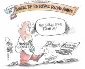
12th Annual Dubious Polling Awards
Media Polls
Featured